
I used to start coloring the way I start snacking at a party. A little of this, a little of that, and suddenly my page looked like it got dressed in the dark. The fix was not “be more talented.” It was simply choosing a small, cohesive color palette before I touched the page.
Think of a palette like setting the table. When the dishes match, even a simple meal looks intentional. In this guide, I will walk you through a few friendly color theory basics and give you practical ways to choose colors that tend to look like they belong together.
What cohesive means
A cohesive palette is just a set of colors that repeat and relate to each other. You are aiming for:
- Repetition: using the same few colors across the whole page so nothing feels random.
- Controlled contrast: some areas pop, but the page still feels calm and readable.
- A consistent mood: cozy, bright, beachy, spooky, springy, and so on.
This matters even more on busy pages like mandalas, gardens, or patterned designs, where too many unrelated colors can turn into visual noise.
My 3-step palette routine
Step 1: Pick a star color
Choose one color you want the page to revolve around. This is usually the color you love most in the moment, or the one that matches the vibe you want.
- Want cheerful? Start with a warm yellow or coral.
- Want calm? Start with a dusty blue or soft green.
- Want dramatic? Start with deep purple, navy, or charcoal.
Step 2: Choose 2 supporting colors
These are the friends of your star color. Depending on the scheme you use, they will either sit close to it (harmonious) or across from it (bold contrast).
- If your star is coral, your supports might be peach and warm yellow for a soft, sunny feel.
- If your star is coral but you want more punch, try teal as contrast and navy to deepen it.
Step 3: Add 1 neutral and 1 spark (optional)
This is my little secret sauce:
- Neutral: cream, tan, warm gray, cool gray, brown, or black for grounding.
- Spark: a tiny accent color you use sparingly (bright teal, hot pink, lime, or a “gold” vibe like ochre). If you have a metallic gel pen, this is also a fun place to use it.
If you stop at about 4 to 6 total colors, your page will usually look more unified.
Color schemes that usually work
You do not need to memorize a color wheel to use these. Just remember the relationships.
Analogous
Best for: gentle, harmonious pages that feel naturally matched.
How it looks: colors that sit next to each other, like blue + blue-green + green.
- Easy palette ideas: teal, green, yellow-green, plus a warm gray neutral
- Another one: pink, red, orange, plus cream
Tip: Use one of the three as the main color (about 60%), one as secondary (30%), and one as the small accent (10%).
Complementary
Best for: bold focal points, high contrast, “wow” pages.
How it looks: pairs like blue and orange, purple and yellow, red and green.
- Easy palette idea: navy + peach, plus tan and uncolored paper
- Another one: purple + mustard, plus soft gray
Tip: If opposites feel too loud, mute one of them. For example, swap bright orange for terracotta, or bright green for sage.
Split complementary
Best for: when you want contrast but not chaos.
How it looks: pick one color, then use the two colors next to its opposite. Example: blue with yellow-orange and red-orange.
- Easy palette idea: blue + coral + golden yellow, plus warm gray
Tip: This scheme is fantastic for floral pages because it gives you a natural mix of leaf and petal colors with built-in balance.
Triadic
Best for: playful pages, kids coloring, festive designs.
How it looks: three colors with equal spacing like red, yellow, blue or purple, green, orange.
- Easy palette idea: red + yellow + blue, plus a neutral (tan or gray)
Tip: Pick one of the three to be the boss color and keep the other two more limited. Otherwise it can feel like a bag of candy exploded.
Monochrome
Best for: stress-free coloring, shading practice, elegant results.
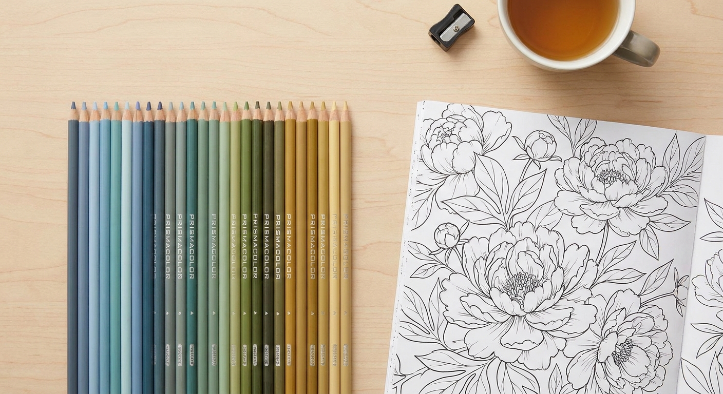
How it looks: one hue in multiple values (light to dark). Example: pale sky blue, medium blue, deep navy. This is what I mean by a one-color family.
- Easy palette idea: 4 blues plus a warm gray for tiny details
Tip: If your set does not have many shades, fake it by using lighter pressure, layering gently, or blending with a light gray.
Pick colors from the page
Sometimes the best palette is hiding in the line art.
Let the subject choose
- Florals: pick one petal color family, one leaf family, and one background family.
- Animals: choose realistic fur tones plus one fun accent (like a scarf, bow, or background).
- Mandalas: decide on a repeating order (for example: blue, teal, cream, ochre) and stick to it like a calming chant.
Choose the focus
Before coloring, point to one spot and say, “You are the star.” That is where your highest contrast goes.
- Dark next to light
- Bright next to muted
- Warm color against cool surroundings
Everything else supports that moment.
Quick palette formulas
If you want a shortcut, here are a few plug-and-play sets that tend to look cohesive on almost any page:
- Cozy bakery: cream, tan, cocoa brown, dusty pink, sage
- Ocean calm: navy, teal, seafoam, sand, soft gray
- Spring garden: coral, blush, light green, deeper green, warm yellow
- Night sky: indigo, deep purple, slate gray, silver-gray, small pops of ochre
- Autumn walk: mustard, rust, olive, brown, cream

Use value and temperature
Value: lights, mids, darks
Even a gorgeous palette can look flat if everything is the same darkness. Try to include:
- 1 to 2 light colors (highlights, background breathing room)
- 2 to 3 medium colors (the main body of your page)
- 1 dark color (definition, shadows, outlines, depth)
Temperature: warm or cool home base
Warm colors lean sunny and cozy. Cool colors lean calm and airy. Mixing is absolutely allowed, but cohesion often comes from deciding which side is home base.
- Warm-leaning palette example: terracotta, peach, mustard, warm brown, cream
- Cool-leaning palette example: teal, mint, denim blue, cool gray, uncolored paper
Saturation: bright or dusty
Saturation is just how intense a color feels. If a page starts looking a little loud, try swapping one bright color for a dustier version, or add a neutral to give your eyes a place to rest.
Test in 60 seconds
I always do a tiny test before I commit. It saves so much grumbling.
- Pick a small corner of the page, or a duplicate motif if the design repeats.
- Color a thumbnail swatch of your planned colors on scrap paper.
- Check contrast: can you still see the details when two colors touch?
- Squint test: squint at the page. Does it look calm and grouped, or busy and scattered?
If something feels off, you usually only need one small tweak: mute one bright color, swap a midtone for a darker shade, or add a neutral.
Common mistakes and fixes
Too many main characters
Fix: pick one dominant color and let the others be supporting actors. Repetition makes the page feel planned.
Everything is super bright
Fix: add a soft neutral, or trade one neon for a dusty version. A little quiet space makes bright accents feel special.
Muddy look from over-layering
Fix: if you are getting mud, try fewer layers, lighter pressure, and give each layer a clear job. As a beginner rule, layering warm-with-warm and cool-with-cool can help, but mixing warm and cool on purpose can also look amazing once you know what you are aiming for.
Background steals the show
Fix: make the background lighter, grayer, or less saturated than the main subject.
Different mediums, same idea
The palette trick works with any supplies, but it behaves a little differently:
- Colored pencils: forgiving and great for small palette experiments because you can layer and adjust as you go.
- Markers: less forgiving because they lay down bold color fast, so planning a limited palette and doing a quick swatch test matters even more.
- Crayons: beautiful for big, simple shapes. A small set of repeatable colors plus one dark for definition can make crayons look surprisingly intentional.
If you want extra help
If you are newer to coloring, or you just want more confidence with the basics, my Coloring Pages Guide is a nice place to settle in. It is full of low-pressure tips for making coloring feel relaxing instead of complicated.
And if you ever feel stuck mid-page, remember this: a cohesive palette is not about rules. It is about giving your brain fewer decisions so you can enjoy the soothing part. The coloring part.
Palette FAQ
How many colors should I choose?
A great starting point is 4 to 6 colors, including a neutral. Busy pages can handle more, but cohesion is easier when your palette is small and repeated.
What if my set is tiny?
That is honestly perfect for cohesion. Choose one main color family (like blues), add the closest neighbor color you have (blue-green or purple), and use brown or gray as your neutral.
How do I make a palette look more grown up?
Use slightly muted versions of your colors, add a warm gray or tan, and include at least one dark value for depth. A little restraint goes a long way.
Do I need a color wheel?
No. It can be helpful, but you can do plenty by thinking in simple relationships: neighbors (analogous), opposites (complementary), and monochrome (one hue in multiple values).