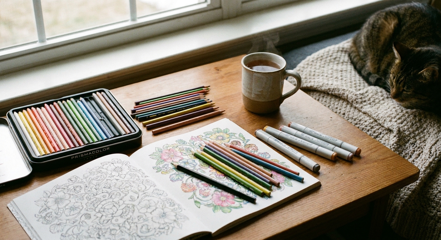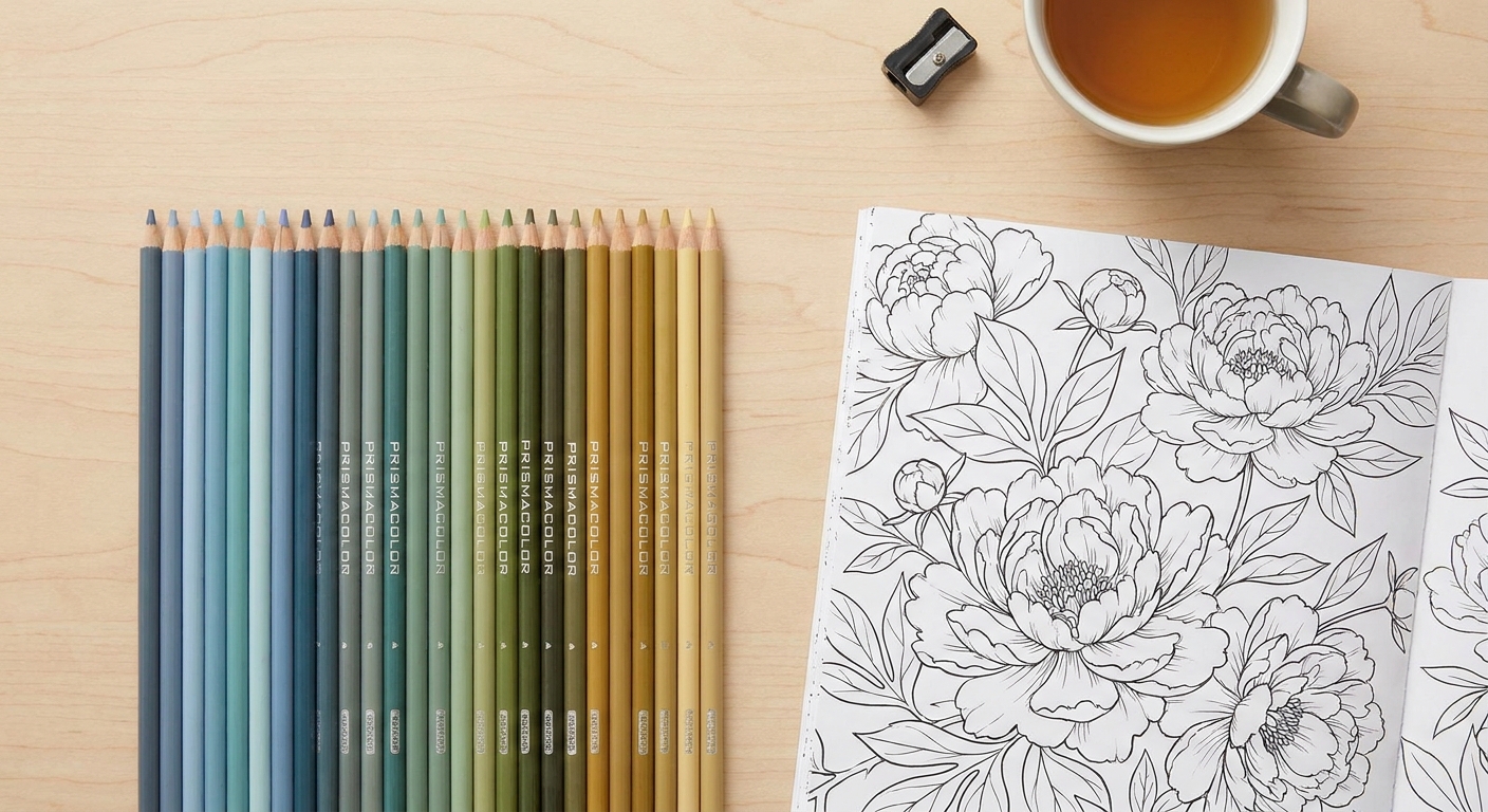

When I was growing up, our dining table was basically a permanent art station. There were always colored pencils rolling under placemats, half-finished doodles, and someone insisting that this shade of blue was “more ocean-y.” That is probably why blending feels so comforting to me now. It is not about perfection. It is about taking a flat little shape on a page and gently coaxing it into something that looks soft, rounded, and alive.
If you have ever looked at your adult coloring pages and thought, “Why does mine look streaky?” or “How do people get that smooth gradient?”, you are in exactly the right place. You can get buttery shading with standard colored pencils, even budget sets, using a few reliable habits.
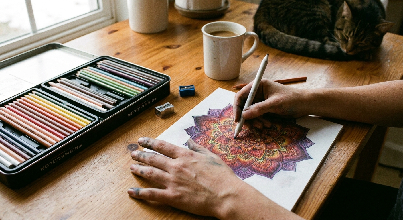
What blending means
Colored-pencil blending is mostly two things happening together:
- Layering: you build color in thin, semi-transparent passes so the tooth of the paper fills gradually.
- Burnishing: you press harder near the end to push pigment into the paper and smooth out the texture.
Streaks usually come from one of these:
- Pressing hard too early, which can leave dents that are hard to fix later, especially on thinner coloring-book paper.
- Using a slightly dull pencil tip for detailed areas, which skips over paper tooth.
- Trying to jump from light to dark in one layer instead of several.
- Paper texture grabbing pigment unevenly, especially on thinner coloring-book paper.
The good news: all of those are fixable with technique, not fancy supplies.
My simple setup
You do not need a studio. You need a few small helpers that make blending easier.
Supplies that help
- Two similar colors plus a light blender shade: for example, a light peach, a mid peach, and a cream. The “blender” can simply be a lighter version of your main color.
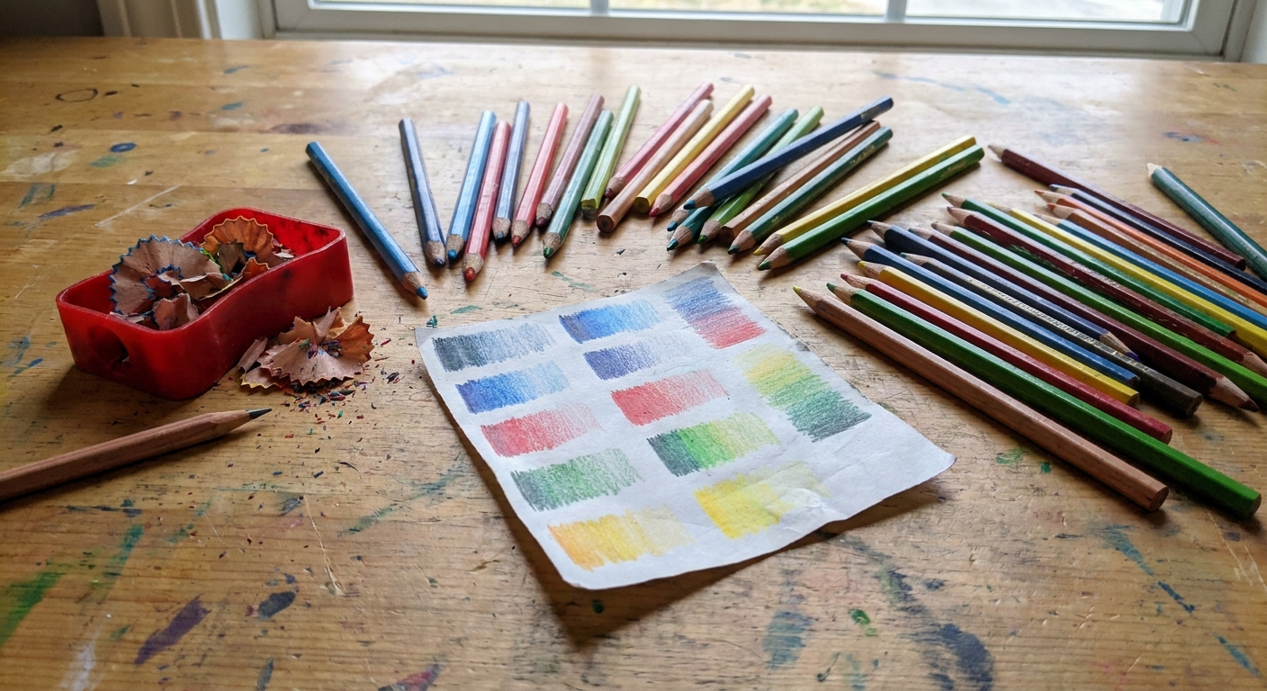
- A scrap sheet of paper: to test pressure and color combos before you commit.
- A sharpener you trust: not because you need needle points all the time, but because consistency matters.
- Something to protect the page underneath: one extra sheet prevents waxy transfer and keeps your hand oils off the work.
If you are newer to adult coloring, you might also like my general overview on paper, tools, and printing habits in our coloring pages guide.
Layer, soften, deepen
This is the routine I use over and over. It works on petals, faces, animals, ornaments, and basically anything that needs gentle dimension.
Step 1: Start light
Hold your pencil a little farther back than usual and use light pressure. I like small circular strokes or short back-and-forth strokes that overlap. The goal is to “dust” color onto the paper, not fill it instantly.
- Lay down your lightest color first in the whole area (or at least where the light will hit).
- Keep your hand moving so you do not create hard lines.
Step 2: Add midtone
Now layer your middle shade where the object curves away from the light. Think of a sphere: lightest at the highlight, darkest at the edge, with a soft transition between.
- Use light pressure again.
- Overlap the midtone slightly into the lighter area so the transition begins to happen naturally.
Step 3: Add dark last
Dark shades are powerful. Place them in the deepest shadow areas only: under folds, at the base of petals, along the underside of a leaf, or where two shapes touch.
Then, instead of scrubbing the dark outward, do the opposite: pull the lighter color into the dark. This keeps shadows rich but not muddy.
Step 4: Blend with the light shade
This is the simplest “blend” there is. Go back to your lightest pencil and glaze over the border where light meets midtone, and where midtone meets dark. Use tiny circles and gentle pressure.
You are not erasing lines. You are filling paper tooth with a smoother mix of pigments.
Step 5: Burnish at the end
When your shading looks right, burnish by increasing pressure with:
- Your lightest color, or
- A colorless blender pencil, if you own one.
Burnishing is like ironing fabric. It compresses and smooths. Use it at the end because it can make it harder to add more layers afterward.
Pick a blending method
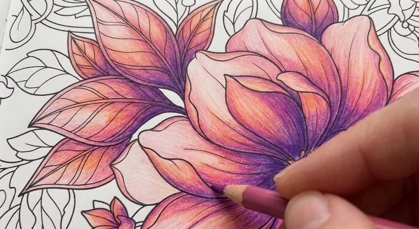
Different pages and papers behave differently. Here are three ways to get smooth shading with regular pencils, from gentlest to boldest.
1) Layers only
This is the safest approach when you are coloring in a book and cannot tolerate heavy pressure or moisture.
- Build 5 to 10 light layers.
- Switch colors frequently rather than finishing one color all at once.
- End with a light glaze of your lightest shade over the whole area to unify it.
2) Burnishing
Burnishing gives that smooth, almost “printed” finish.
- Layer normally first.
- Press firmly with a light pencil to blend transitions.
- Accept that burnished areas can resist new layers, so commit before you press hard.
3) Solvent blending
Some colorists blend colored pencils with a tiny bit of solvent on a blending stump or cotton swab. This softens the binder so pigment moves more easily, which can create a very smooth look.
A few gentle cautions if you try it:
- Test on a scrap first. Thin coloring-book paper can wrinkle or bleed through.
- Use the smallest amount that works, and avoid soaking the paper.
- Work with good ventilation and recap anything you are using right away.
Wax vs oil pencils
Not all colored pencils feel the same, and it is not your imagination.
- Wax-based pencils often feel softer and can burnish beautifully. They can also develop “wax bloom” over time, which is a hazy film on heavy, dark areas. If you see it, a gentle wipe with a soft cloth usually helps.
- Oil-based pencils tend to feel a bit firmer and can keep a sharper point. Many people find they layer cleanly without getting as slick as quickly.
You can blend well with either type. The main trick is still the same: light layers first, heavy pressure last.
Easy shading recipes
Here are a few color “formulas” that make blending easier because you already know the order.
Skin and warm neutrals
- Base: cream or very light peach
- Mid: peach or light tan
- Shadow: light brown or muted rose
- Deep shadow: cocoa or sienna used sparingly
Tip: for softer skin shadows, reach for a muted rose instead of a darker brown. It keeps things warm and natural.
Leaves and botanicals
- Base: yellow-green
- Mid: true green
- Shadow: blue-green or forest green
- Depth: a touch of dark brown at the base or under overlaps
Tip: adding a hint of blue-green into shadows makes leaves look more realistic than using black.
Blue gradients
- Base: very light blue
- Mid: sky blue
- Shadow: indigo or slate blue
- Bright pop: burnish highlights with white or a pale icy blue
Mistakes and fixes
You can see every stroke
- Fix: switch to tiny circular strokes and add 2 to 3 light layers of your lightest shade over the area.
- Also helps: sharpen your pencil and reduce pressure.
Your shadows look dirty
- Fix: avoid black for most shading. Try dark brown, indigo, or a deeper version of your main color.
- Also helps: layer a midtone back over the shadow edge to soften it.
You made a hard line
- Fix: glaze over it with the lighter color using very light pressure, extending slightly past the line.
- If it is deep: treat it as a design choice and turn it into a cast shadow or crease.
The paper is shiny too soon
- Fix: you are burnishing early. Back off pressure and return to layering.
- Tip: on thin paper, aim for “smooth enough” instead of ultra-polished.
A quick practice
If you want a low-pressure way to build confidence, pick one repeated element on your page (a single leaf, one petal shape, one feather) and practice the same gradient 5 times in a row. Repetition is where blending suddenly starts to feel automatic.
- Choose 3 pencils: light, mid, dark.
- Color the whole shape lightly with the light shade.
- Add midtone to one side, overlapping into the light area.
- Add dark to the deepest edge.
- Blend the transitions by glazing with the light shade.
- Optional: burnish the highlight area with white or cream.
It is a tiny ritual, and it makes the rest of the page feel calmer.
FAQ
Do I need expensive colored pencils to blend smoothly?
No. Higher-end pencils can feel creamier, but smooth blending is mostly about light layers, patience, and saving heavy pressure for the end.
Should I blend with a paper stump or tissue?
For colored pencils, rubbing with tissue can sometimes push pigment unevenly or flatten tooth in a patchy way. I prefer blending by layering, or burnishing with a light pencil. If you use a stump, use it gently and test first.
What is the easiest way to make something look 3D?
Add three zones: a highlight (light), a midtone, and a shadow (dark). Even a simple sphere effect instantly makes adult coloring pages look more dimensional.
Can I turn a finished colored page into a card?
Yes, and it is one of my favorite ways to share your coloring without needing to frame it. I walk through the steps here: Turn a coloring page into a folded card.
One last reminder
Blending is not a talent you either have or do not have. It is a rhythm. Light layers, thoughtful shadows, and a soft hand. Give yourself one page where the goal is simply to practice the transitions, and let the rest be play.
If you want to know more about how I approach coloring as a wind-down ritual, you can read a bit about me here: Penelope Dixon.