

One of my favorite little coloring “tricks” is this: when a page gives you a beautiful subject floating in a sea of white space, you do not have to accept the void. You get to decide where that fox lives, what season those flowers are blooming in, or what kind of sky sits behind that mandala. Adding an original background sounds fancy, but it is really just a handful of friendly techniques that turn a simple page into a tiny world.

Below are my go-to ways to build backgrounds with sketching, stenciling, and a bit of gentle painting, all while keeping the main coloring subject as the star.
Before you start: protect the subject and pick a plan
Backgrounds are easiest when you make two tiny decisions up front: what is the setting, and how “loud” should it be?
- Decide the story in one sentence. “A kitten on a windowsill at sunset.” “A mushroom in a foggy forest.” This keeps you from adding every background idea you have ever had at once.
- Reserve a halo. Leave a thin ring of white space around the subject, or keep the background lighter right behind it. That separation makes everything look intentional.
- Choose a limited palette. Two to five colors is plenty for most backgrounds. If you want a quick way to keep things cohesive, I walk through it here: Choose a cohesive color palette before you color.
- Test on a scrap. Even if it is the back of the page or a sticky note, a 10-second test saves a lot of sighing later.
If you are working with markers, it also helps to know your tool personality first. This quick comparison can help you decide whether to go bold or stay soft: Markers vs. colored pencils.
Technique 1: the “faint pencil map” background
This is my most-used method because it is gentle, forgiving, and it keeps you in control. Think of it like lightly blocking in a stage set behind your main character.
How to do it
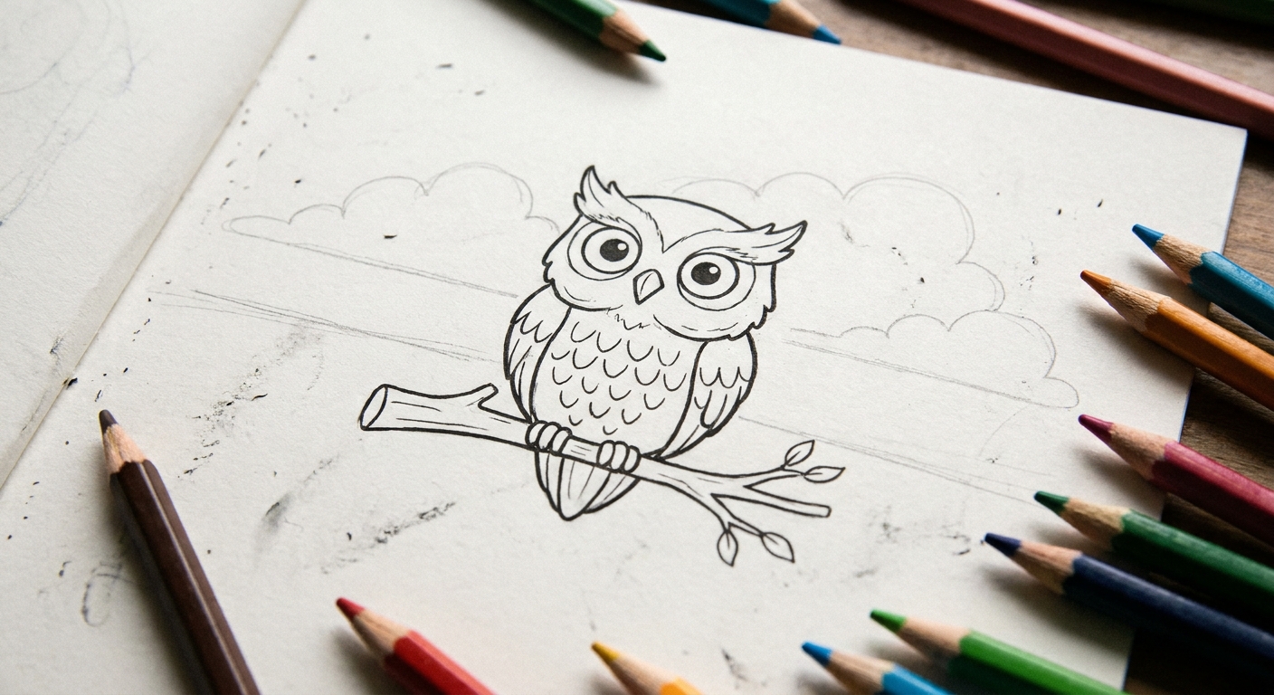
- Lightly sketch the big shapes first. Horizon line, a few clouds, simple trees, a table edge, a window frame, or a few oversized leaves. Big and simple beats small and complicated.
- Repeat one shape. Three to seven similar items instantly reads as a setting: several bricks, several stars, several blades of grass, several snowflakes.
- Ink is optional. Often I do not ink background lines at all. A pale pencil line under colored pencil shading looks softer and keeps the subject outlined and crisp.
- Color from farthest to nearest. Sky first, then distant shapes, then closer shapes. It creates depth without you having to do “real” perspective math.
Easy background ideas: a simple skyline silhouette, a kitchen table surface, a garden fence, a few big tropical leaves, a star field, or a single curved hill line with a path.
If the blank space is intimidating, it can help to warm up by drawing your own pages from scratch. I share my simple approach here: Draw your own custom coloring pages from scratch.
Technique 2: patterns that fade outward
When you are not sure what environment to draw, patterns are a lifesaver. The trick is to make them fade as they move away from the subject so they do not compete with it.
Three fade-friendly pattern recipes
- Dots: Larger and closer near the edges, smaller and lighter near the subject. Or the reverse if you want a “spotlight” effect.
- Lines: Curved lines for wind, straight lines for a modern look, wavy lines for water. Increase spacing as you approach the subject.
- Simple motifs: Tiny hearts, stars, leaves, snowflakes, or little flower shapes, drawn quickly and unevenly so it feels playful, not mechanical.
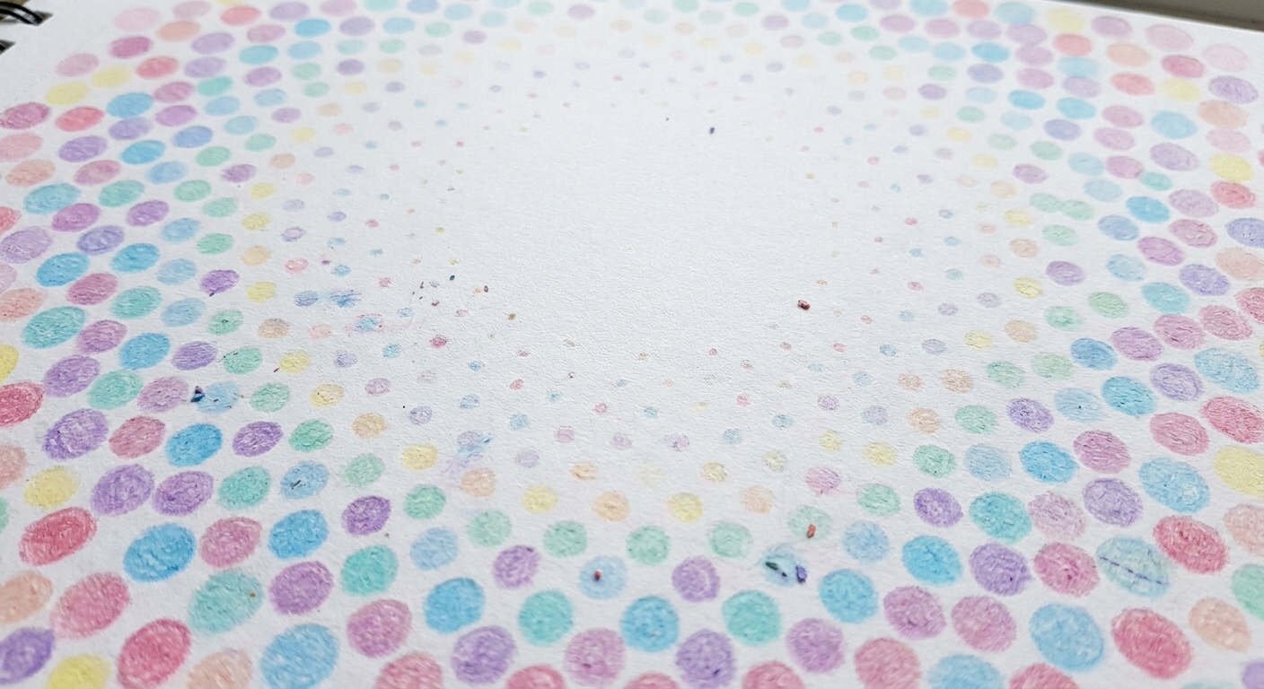
My favorite shortcut: Put the densest pattern in the corners. Corners are where blank space looks the most awkward, and filling them makes the whole page feel designed.
Technique 3: stencil and trace backgrounds
Stencils can be store-bought, but some of the best ones are sitting in your kitchen drawer right now. A stencil background is perfect when you want clean shapes fast.
Great everyday “stencils”
- Coins for circles, bubbles, or bokeh lights
- A ruler for frames, rays, windows, and simple architecture
- Paper doilies for lace-like mandala textures
- Leaves from outside for organic silhouettes
- Cookie cutters for bold, simple outlines
Two ways to keep stencils from taking over
- Use lighter pressure. Especially with graphite. You can always darken later.
- Color them softly. Try one color family, or shade each shape with just one to two values.
If you want a neat finishing touch, you can add a simple border frame using a ruler. A background plus a border makes even the simplest page feel “complete,” like it belongs on a fridge door gallery.
Technique 4: watercolor-style washes
Yes, you can add a painted wash behind line art, even if you are not a painter. The secret is using very little water and treating the background like atmosphere, not a detailed scene.
Low-risk wash options
- Colored pencil + blender pencil: Shade lightly, then smooth. If you want help making it velvety, see: How to blend colored pencils for smooth shading.
- Water-based markers + light water: Put marker on a plastic surface (like packaging), pick it up with a damp brush, then paint. This keeps the page from getting too wet.
- Watercolor pencil: Lay down pencil, then activate with a barely damp brush. You stay in control because the pigment starts exactly where you drew it.
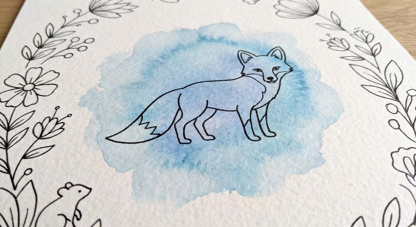
A tiny safety checklist
- Place scrap paper under your page to protect the next sheet.
- Let the wash dry completely before coloring over it.
- Keep the area behind the subject lighter to preserve contrast.
One more gentle suggestion from many ruined experiments: if your paper is thin, skip heavy water. A background that is slightly textured looks dreamy. A background that is soggy looks tired.
Technique 5: quick environments with three layers
This is the fastest way to make a background feel like a place, not just decoration. You do not need perfect perspective. You just need three layers.
Pick one from each layer
- Background: sky gradient, distant hills, simple wall texture
- Midground: a fence line, trees, curtains, a bookshelf, a city silhouette
- Foreground: a few big leaves, a rug pattern, stones, grass tufts, snow drifts
Penelope kitchen-table example: If I am coloring a single teacup, I will add a tabletop line (foreground), a simple wallpaper pattern (midground), and a pale window rectangle with sky color (background). Suddenly the teacup is having a whole cozy day.
Negative space tricks that look impressive
Sometimes the most original background is the one you barely draw. These are calming, meditative techniques that still make the page feel finished.
- Glow ring: Color a soft halo behind the subject, then fade outward. It is like turning on a little lamp in the scene.
- Shadow anchor: Add a simple cast shadow under the subject so it is not floating. Even a light gray oval helps.
- Vignette corners: Shade the corners darker and leave the center lighter. It frames your subject without any added objects.
- One-line setting: A single curved hill, one shelf line, one horizon, one tabletop. Minimal lines, maximum “place.”
Keep the background quiet
This is the part most of us learn the hard way. If your background starts yelling, here is how to hush it back down.
Use contrast on purpose
- Sharper edges belong to the subject. Keep background edges softer, lighter, or less detailed.
- Lower saturation belongs to the background. Save your brightest crayon colors for the focal point.
- Busy details belong farther away. If you add texture, keep it small and faint, especially near the subject.
Two “rescue moves”
- Unify with a light glaze: A very light layer of one color over a too-busy area can calm it down and make it feel cohesive.
- Add a simple frame: A border line can visually contain a background that wandered.
If you are feeling stuck or you started and now you hate it, you are not alone. I keep a whole toolbox for that moment here: Coloring your way out of creative block.
Mini background prompts
If you want to sit down and start without thinking too hard, pick one prompt and go. One. Not eight.
- A subject in front of a simple window with a gradient sky
- A forest fog background made with light gray swirls and a few tree trunks
- A night sky with a soft indigo fade and scattered stars
- A underwater scene with wavy light beams and bubble circles
- A cozy room with one shelf line and a wallpaper pattern
- A garden with large leaf shapes in the corners
Turn the finished page into something
Once you have a subject plus a background, your page often looks “gift-ready.” If you want to turn it into a keepsake, you might like my simple folding method here: Turn a coloring page into a folded card.
And if you are ever unsure what to try next, the hub pages are a cozy place to browse: Coloring pages guide.
A gentle reminder from my messy table
Backgrounds are not a test. They are permission to play. The negative space is not “empty,” it is available. Start with one simple layer, keep it lighter than your subject, and let the page teach you what it wants next. That is the whole magic.